SimplifySOW
SimplifySOW
Redesigned a complex Statement of Work (SOW) management system for enterprise clients, streamlining the creation process, enhancing data visualization, and improving overall user experience through intuitive information architecture and modern UI design.

Client Name
SimplifyVMS
Industry Domain
Vendor Management System
Deliverables
Desktop UI/UX
Team
2 Designers, 1 BA, 1 Director
Context
SimplifyVMS is a leading workforce management company that helps large enterprises efficiently manage their temporary workforce. Their suite of products includes vendor management systems, direct sourcing tools, and service contract management solutions. SimplifyVMS's goal is to simplify complex workforce processes, ensure compliance, and optimize costs for businesses. The company serves several high-profile clients, including tech giant Microsoft, renowned educational institution Penn State, and major airline EasyJet.
Background
During my time at SimplifyVMS, I worked on various products across their suite. Notable among these were SimplifyAI, which helps recruiters find the best talent from a large pool of candidates using job and resume parsing capabilities, and SimplifySOW, which helps track work, deliverables, timelines, payments, and more between clients and contract workers (vendors).
I also got an opportunity to work on the company website. I designed and developed it using a no-code tool called Hugo. Even though Hugo is a no-code platform, I still had to write a lot of code, but my background in tech really helped here.
This case study focuses on my role as the Design Owner for the SimplifySOW redesign project. Statement of Work (SOW) is a crucial module within our VMS suite, serving as a vital link between companies and their contract workers (vendors). Given the diverse and demanding nature of our client base, which includes industry leaders across different sectors, ensuring a user-friendly and efficient SOW module was paramount to maintaining our competitive edge and client satisfaction.
SOW Product Journey
The SimplifySOW module consists of two primary flows: Create SOW and SOW Details. These interconnected processes guide users through the lifecycle of a Statement of Work, from inception to execution and monitoring.
1. Create SOW Flow:
This is the starting point for clients initiating a new project or engagement. The Create SOW process is designed to be intuitive and comprehensive, ensuring all necessary information is captured upfront. Key stages include:
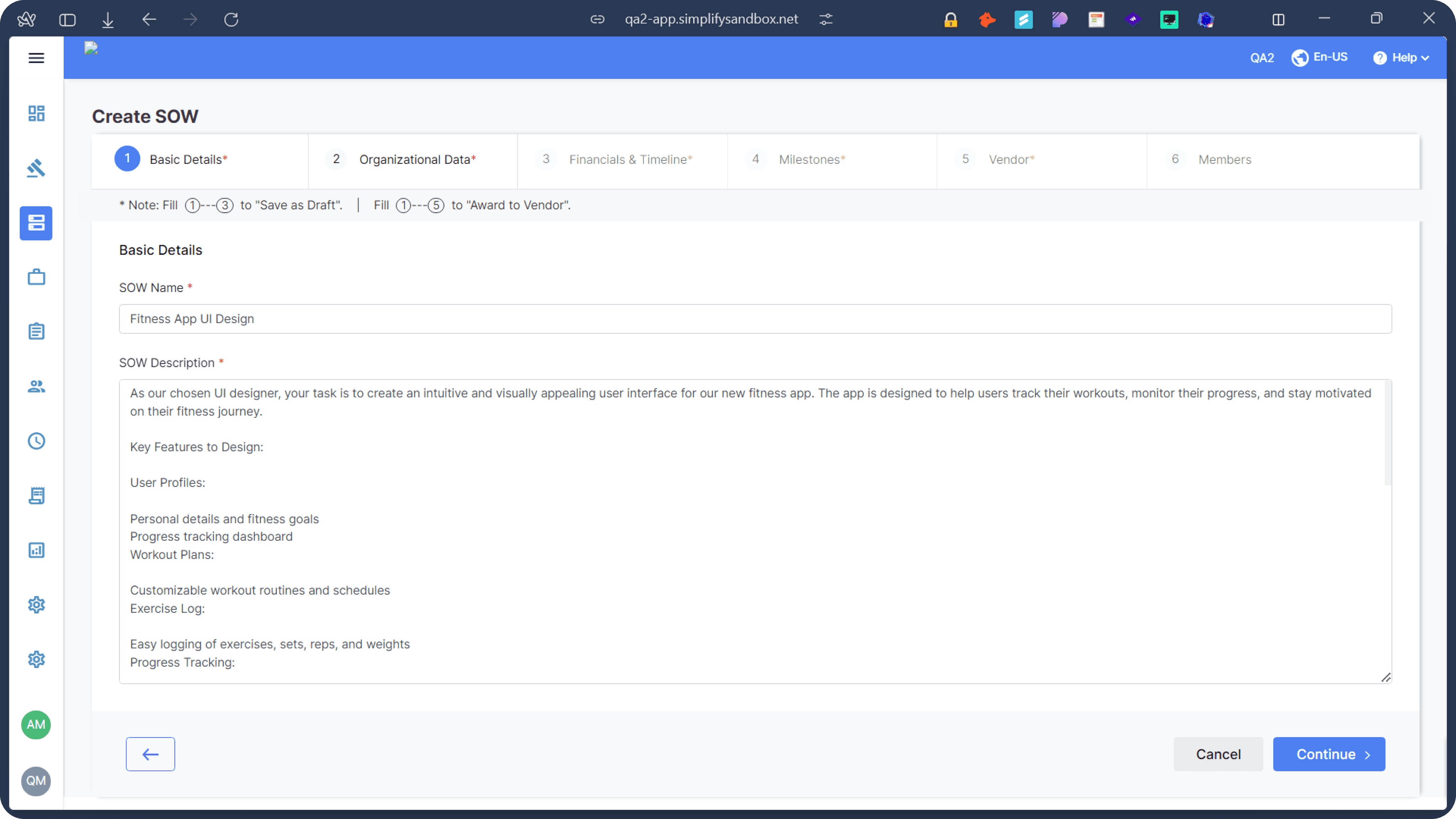
a) Basic Details: Users input fundamental project information such as title, description, start and end dates, and work location.
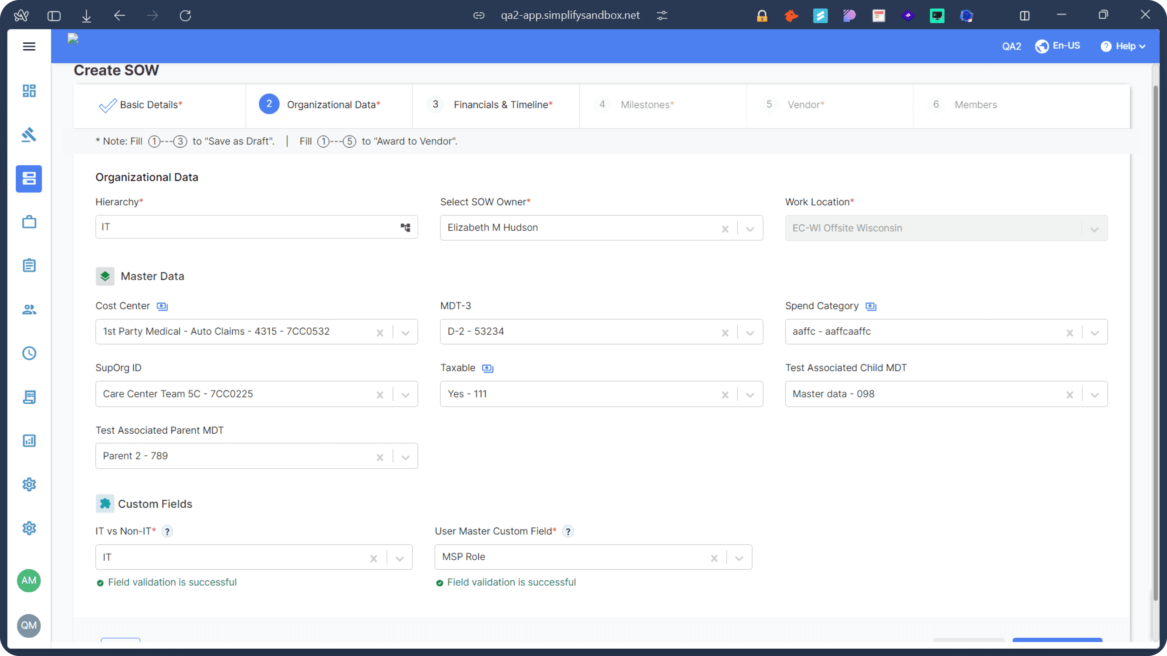
b) Organizational Data: This section captures critical business details like spend category, cost center, and any custom fields specific to the client's organization.
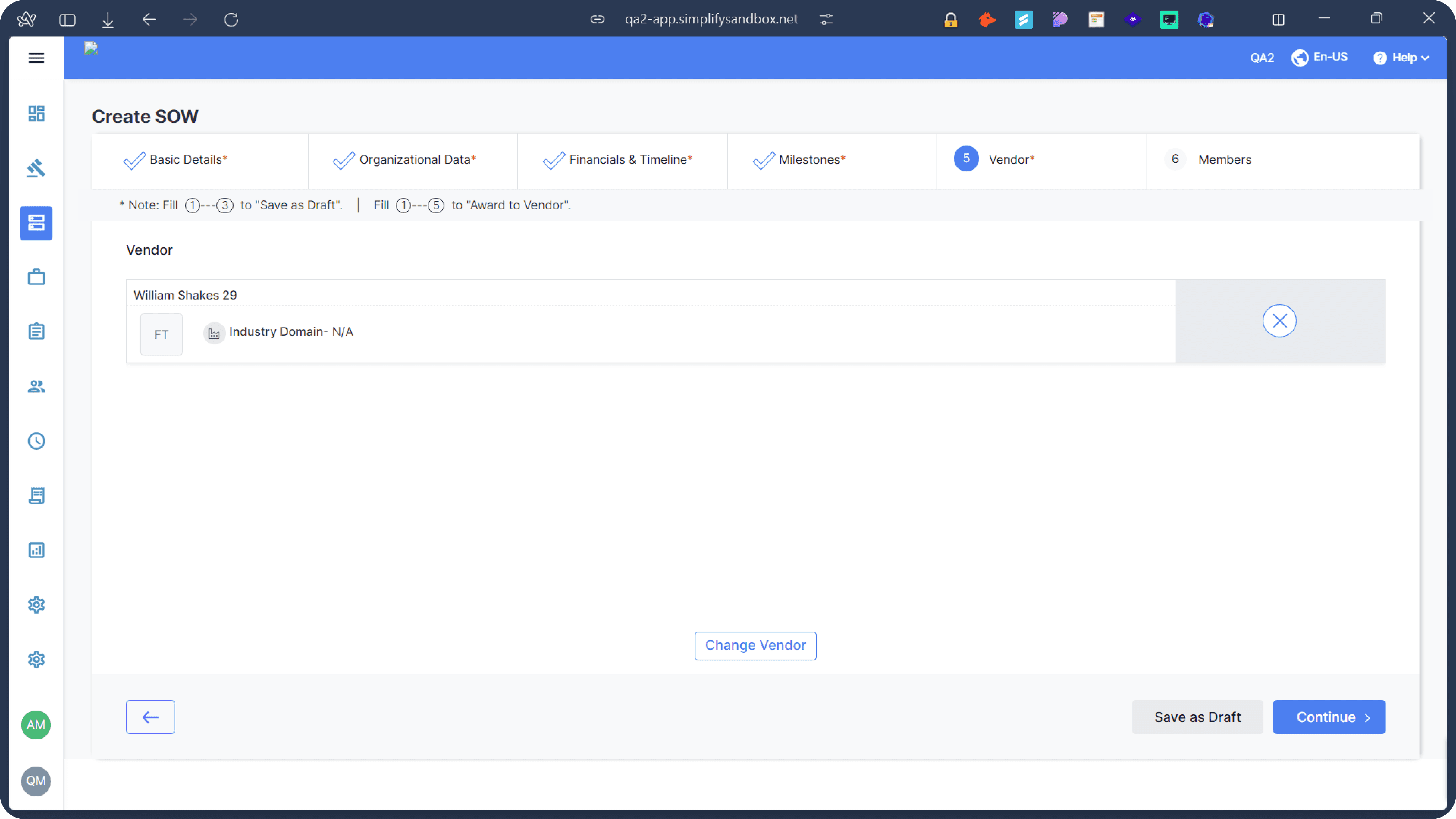
c) Vendor Selection: Users can search and select the appropriate vendor for the project.
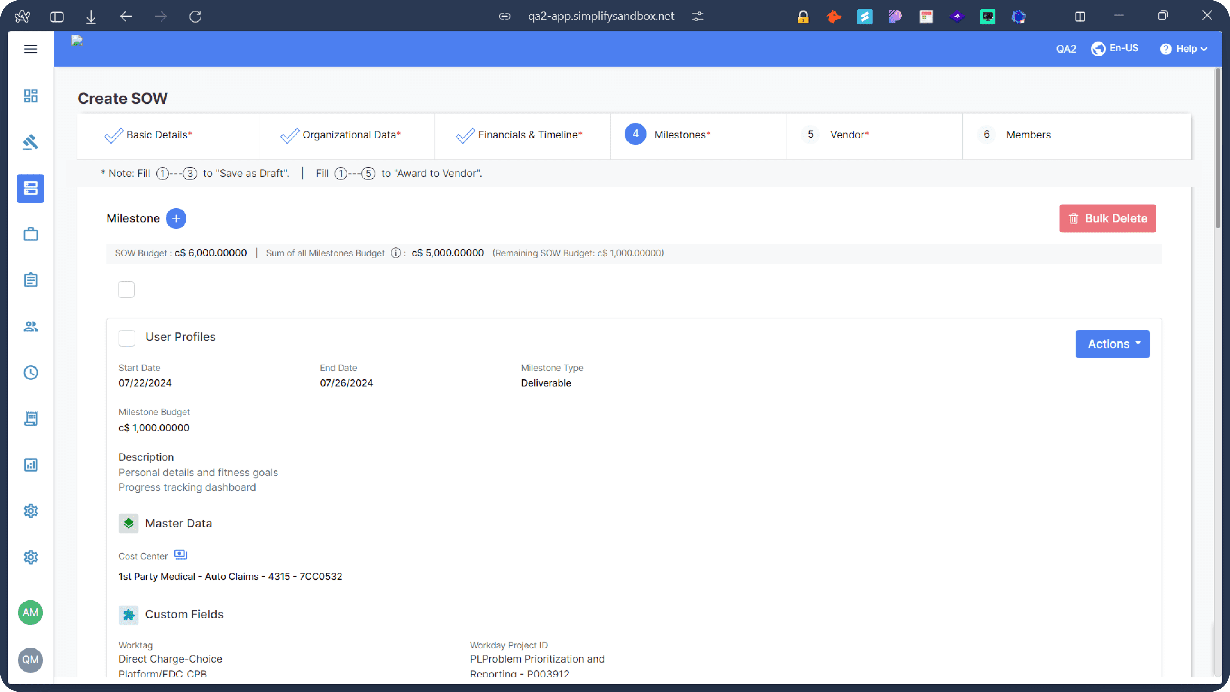
d) Scope Definition: Here, users outline the project's objectives, deliverables, and milestones.
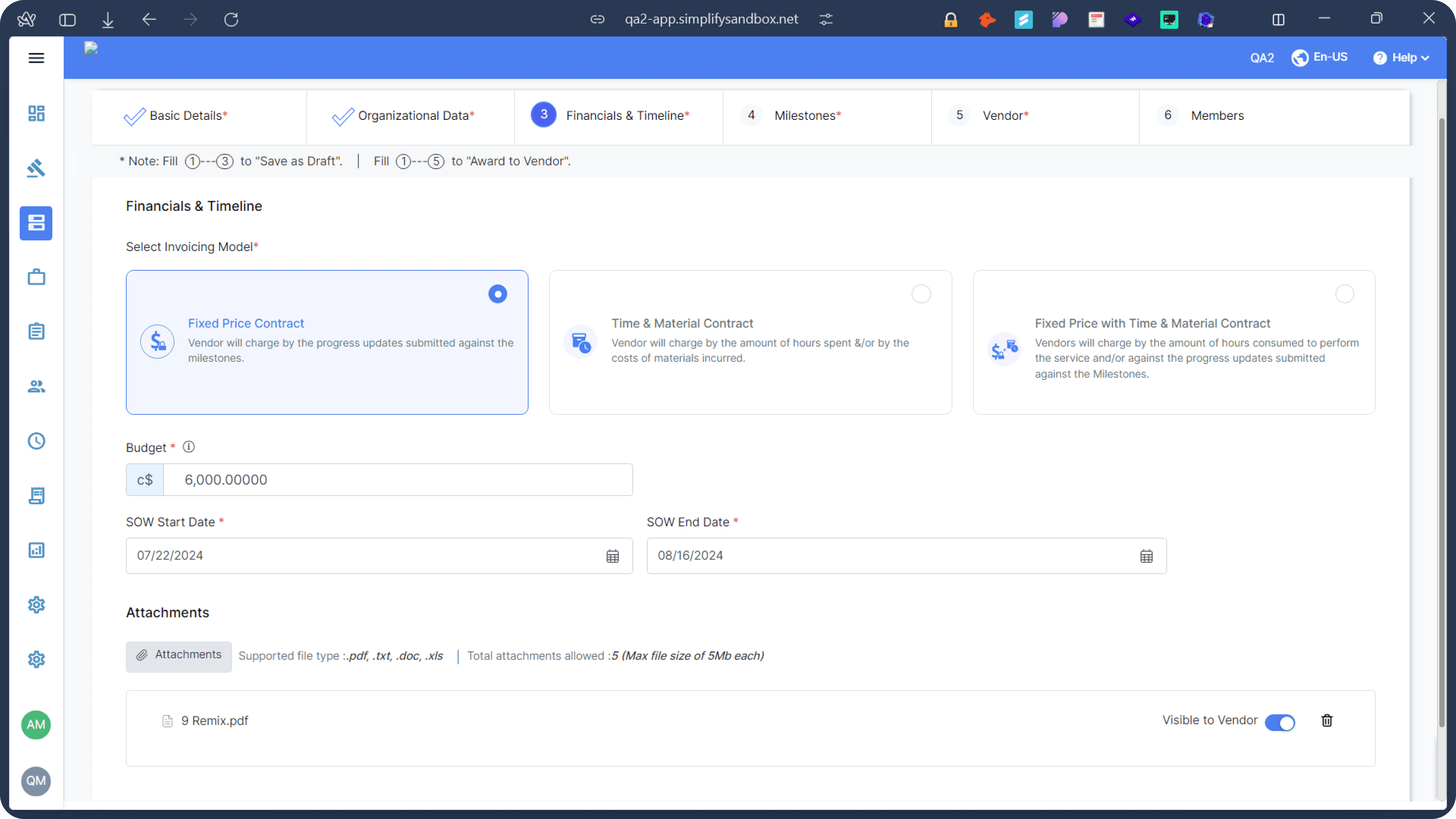
e) Budget Allocation: Users define the project budget and specify the invoicing model (e.g., Fixed Price, Time & Material, Unit Based Pricing).
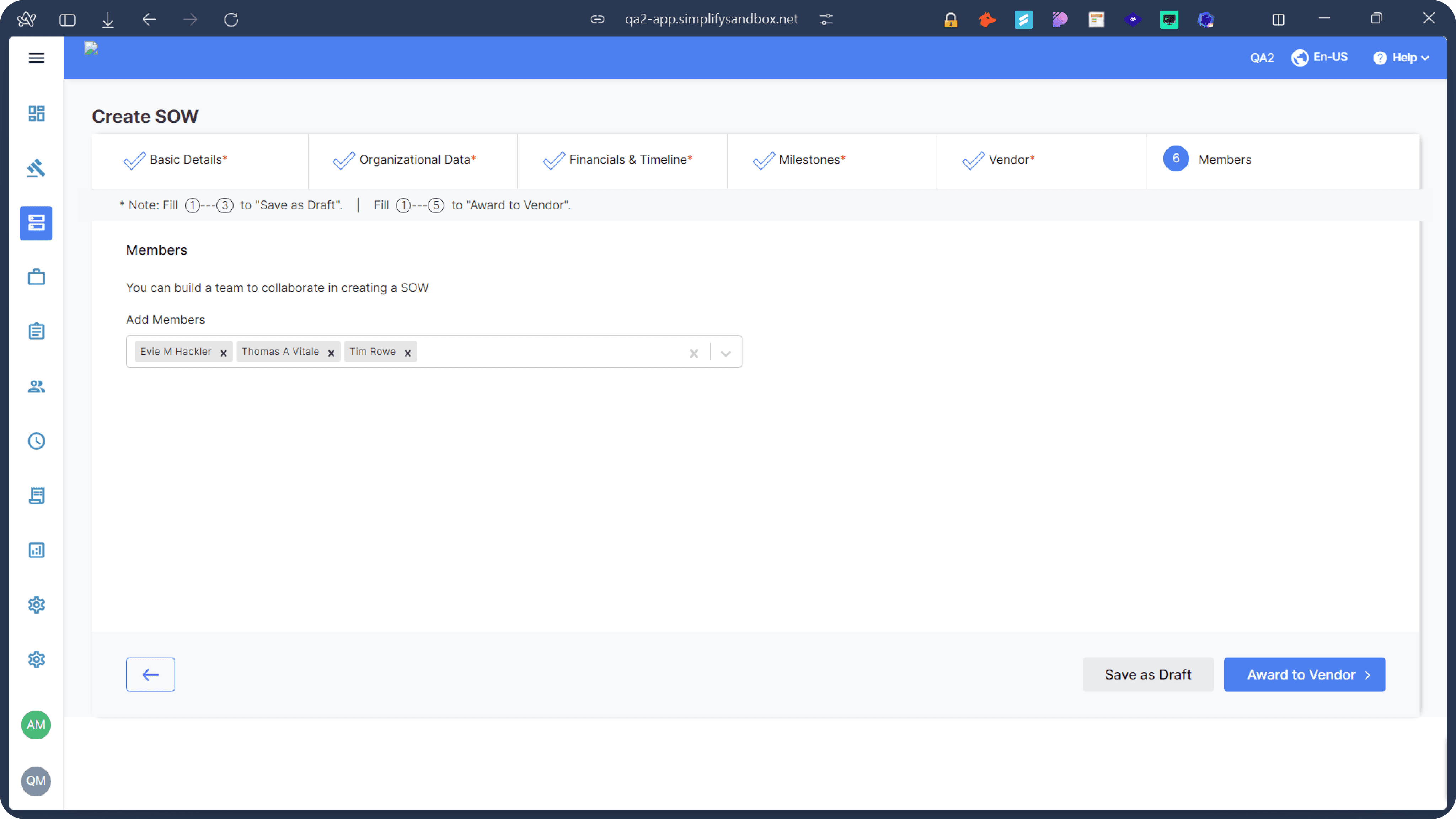
f) Team Assignment: This step allows for the addition of team members, specifying their roles and permissions within the SOW.
g) Supporting Documents: Users can upload relevant files and manage their visibility to vendors.
2. SOW Details Flow:
Once a SOW is created, users are directed to the SOW Details page. This comprehensive dashboard serves as the central hub for managing and monitoring the SOW throughout its lifecycle. Key features include:
a) Summary: Presents a quick reference of essential SOW information and key stakeholders.
b) Milestones: Displays project milestones with due dates, status, and progress tracking capabilities.
c) Contract Terms: Outlines agreed-upon terms, conditions, and contractual obligations.
d) Progress Updates: Allows for regular project status updates and timeline tracking.
e) Assignments: Shows task allocations, enabling creation, delegation, and status tracking.
f) Invoices: Lists all SOW-associated invoices with amounts, due dates, and payment status.
g) History: Maintains a log of all SOW changes and updates for auditing purposes.
The SimplifySOW module consists of two primary flows: Create SOW and SOW Details. These interconnected processes guide users through the lifecycle of a Statement of Work, from inception to execution and monitoring.
1. Create SOW Flow:
This is the starting point for clients initiating a new project or engagement. The Create SOW process is designed to be intuitive and comprehensive, ensuring all necessary information is captured upfront. Key stages include:
a) Basic Details: Users input fundamental project information such as title, description, start and end dates, and work location.
b) Organizational Data: This section captures critical business details like spend category, cost center, and any custom fields specific to the client's organization.
c) Vendor Selection: Users can search and select the appropriate vendor for the project.
d) Scope Definition: Here, users outline the project's objectives, deliverables, and milestones.
e) Budget Allocation: Users define the project budget and specify the invoicing model (e.g., Fixed Price, Time & Material, Unit Based Pricing).
f) Team Assignment: This step allows for the addition of team members, specifying their roles and permissions within the SOW.
g) Supporting Documents: Users can upload relevant files and manage their visibility to vendors.
Throughout this flow, our redesigned interface guides users with clear instructions, input validation, and a progress indicator to ensure all necessary information is provided before submission.
2. SOW Details Flow:
Once a SOW is created, users are directed to the SOW Details page. This comprehensive dashboard serves as the central hub for managing and monitoring the SOW throughout its lifecycle. Key features include:
a) Dashboard: Provides a high-level overview of SOW performance with visual metrics and charts.
b) Summary: Presents a quick reference of essential SOW information and key stakeholders.
c) Milestones: Displays project milestones with due dates, status, and progress tracking capabilities.
d) Contract Terms: Outlines agreed-upon terms, conditions, and contractual obligations.
e) Scope of Work: Details the project's specific tasks, deliverables, and expectations.
f) Progress Updates: Allows for regular project status updates and timeline tracking.
g) Forum: Serves as a communication hub for all SOW-related discussions and record-keeping.
h) Assignments: Shows task allocations, enabling creation, delegation, and status tracking.
i) Invoices: Lists all SOW-associated invoices with amounts, due dates, and payment status.
j) History: Maintains a log of all SOW changes and updates for auditing purposes.
Outcomes of this project
Redesigned Create SOW
Redesigned SOW Details
Let's learn more about SOW
A Statement of Work (SOW) is a crucial document in project management and contract work. It serves as a formal agreement between a client and a vendor or contractor, outlining the specific work to be performed, deliverables, timelines, and payment terms. SOWs are particularly important in managing contingent workforce relationships and complex projects.
Key components of an SOW typically include:
1. Project objectives and scope
2. Specific tasks and responsibilities
3. Deliverables and milestones
4. Timeline and schedule
5. Budget and payment terms
6. Performance standards and quality requirements
7. Reporting and communication protocols
8. Terms and conditions
In the context of workforce management, SOWs help organizations clearly define project parameters, manage expectations, and ensure accountability. They provide a structured framework for both clients and vendors to track progress, manage budgets, and maintain clarity throughout the project lifecycle.
Old UI
The Problem
Our team, consisting of myself as an experienced UX designer, Raj (fellow designer), Divyanshu (Business Analyst), and Atul (Director), collaborated closely to conduct a comprehensive UX audit of the Statement of Work (SOW) management system. We not only leveraged our collective expertise and diverse perspectives but also reached out to several of our clients who had expressed concerns about the tedious processes within the system. This client feedback provided valuable real-world insights into user pain points and frustrations. Through this multi-faceted approach, we identified a range of issues that impact user experience, efficiency, and overall satisfaction with the product. Our analysis covered various aspects, from visual design and information architecture to workflow processes and user interactions, with a particular focus on addressing the concerns raised by our clients. The following list outlines the only few problems we discovered during our collaborative review and client consultations:
Our team, consisting of myself as an experienced UX designer, Raj (fellow designer), Divyanshu (Business Analyst), and Atul (Director), collaborated closely to conduct a comprehensive UX audit of the Statement of Work (SOW) management system. We not only leveraged our collective expertise and diverse perspectives but also reached out to several of our clients who had expressed concerns about the tedious processes within the system. This client feedback provided valuable real-world insights into user pain points and frustrations. Through this multi-faceted approach, we identified a range of issues that impact user experience, efficiency, and overall satisfaction with the product. Our analysis covered various aspects, from visual design and information architecture to workflow processes and user interactions, with a particular focus on addressing the concerns raised by our clients. The following list outlines the only few problems we discovered during our collaborative review and client consultations:
Information Overload: Overwhelming amount of data on screens.
Inconsistent Visual Hierarchy: Important information doesn't stand out.
Non-intuitive Icons: Unclear meaning of some icons used.
Repetitive Information: Redundant display of certain data across sections.
Poor Use of Color: Ineffective color scheme for highlighting important elements.
Lack of User Feedback: Unclear system responses to user actions.
Inflexible Layout: Potential issues with responsiveness across different screen sizes.
Lack of Data Visualization: Missed opportunities for graphical representation of numerical data.
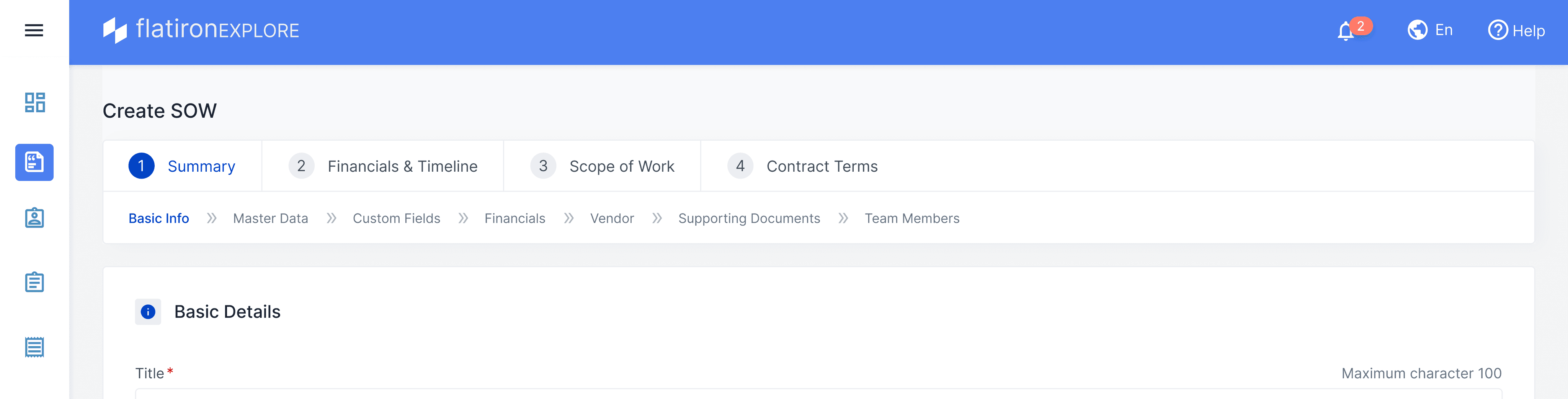
Lengthy SOW Creation Process: Tedious 7-step process for creating a Statement of Work.
Suboptimal Information Architecture: Poor organization and structure of information.
Information Overload: Overwhelming amount of data on screens.
Inconsistent Visual Hierarchy: Important information doesn't stand out.
Non-intuitive Icons: Unclear meaning of some icons used.
Repetitive Information: Redundant display of certain data across sections.
Poor Use of Color: Ineffective color scheme for highlighting important elements.
Lack of User Feedback: Unclear system responses to user actions.
Inflexible Layout: Potential issues with responsiveness across different screen sizes.
Lack of Data Visualization: Missed opportunities for graphical representation of numerical data.
Lengthy SOW Creation Process: Tedious 7-step process for creating a Statement of Work.
Suboptimal Information Architecture: Poor organization and structure of information.
This comprehensive list covers the major UX issues observed in the application, ranging from visual design problems to more fundamental issues with information architecture and user workflows.
This comprehensive list covers the major UX issues observed in the application, ranging from visual design problems to more fundamental issues with information architecture and user workflows.
Old IA to New IA
We improved the Create SOW process by reorganizing information more logically. Our team, including colleagues and key stakeholders, brainstormed to identify and group related information. Unlike the old, unstructured layout, the new Information Architecture (IA) arranges details according to relevance and hierarchy. This redesign makes the process more intuitive, allowing users to navigate and complete SOWs more efficiently. The new structure prioritizes important information, reducing confusion and improving the overall user experience. Importantly, we applied this same improved IA to the SOW Details flow, ensuring consistency and ease of use across the entire SOW lifecycle.
We improved the Create SOW process by reorganizing information more logically. Our team, including colleagues and key stakeholders, brainstormed to identify and group related information. Unlike the old, unstructured layout, the new Information Architecture (IA) arranges details according to relevance and hierarchy. This redesign makes the process more intuitive, allowing users to navigate and complete SOWs more efficiently. The new structure prioritizes important information, reducing confusion and improving the overall user experience. Importantly, we applied this same improved IA to the SOW Details flow, ensuring consistency and ease of use across the entire SOW lifecycle.

Our team, consisting of myself as an experienced UX designer, Raj (fellow designer), Divyanshu (Business Analyst), and Atul (Director), collaborated closely to conduct a comprehensive UX audit of the Statement of Work (SOW) management system. We not only leveraged our collective expertise and diverse perspectives but also reached out to several of our clients who had expressed concerns about the tedious processes within the system. This client feedback provided valuable real-world insights into user pain points and frustrations. Through this multi-faceted approach, we identified a range of issues that impact user experience, efficiency, and overall satisfaction with the product. Our analysis covered various aspects, from visual design and information architecture to workflow processes and user interactions, with a particular focus on addressing the concerns raised by our clients. The following list outlines the only few problems we discovered during our collaborative review and client consultations:
Our team, consisting of myself as an UX designer, Raj (fellow designer), Divyanshu (Business Analyst), and Atul (Director), collaborated closely to conduct a comprehensive UX audit of the SOW. Through our collective expertise and diverse perspectives, we identified a range of issues that impact user experience, efficiency, and overall satisfaction with the product. Our analysis covered various aspects, from visual design and information architecture to workflow processes and user interactions. The following list outlines the key problems we discovered during our collaborative review:
1. Information Overload: Overwhelming amount of data on screens.
2. Inconsistent Visual Hierarchy: Important information doesn't stand out.
3. Cluttered Layout: Crowded screens with little white space.
4. Complex Navigation: Unclear sidebar icons and poor placement of navigation elements.
5. Unclear Status Indicators: Small, easily overlooked status notifications.
6. Confusing Action Buttons: Inconsistent styling of action buttons.
7. Inconsistent Date Formats: Multiple date formats used throughout the interface.
8. Limited Context for Data: Lack of explanations for technical terms and fields.
9. Non-intuitive Icons: Unclear meaning of some icons used.
10. Repetitive Information: Redundant display of certain data across sections.
11. Poor Use of Color: Ineffective color scheme for highlighting important elements.
12. Lack of User Feedback: Unclear system responses to user actions.
13. Inflexible Layout: Potential issues with responsiveness across different screen sizes.
14. Unclear Relationships: Connections between different sections not immediately apparent.
15. Limited Search and Filter Options: Basic search functionality may be insufficient for large datasets.
16. Inconsistent Terminology: Use of technical terms without clear definitions.
17. Lack of Data Visualization: Missed opportunities for graphical representation of numerical data.
18. Lengthy SOW Creation Process: Tedious 7-step process for creating a Statement of Work.
19. Suboptimal Information Architecture: Poor organization and structure of information.
20. Inconsistent Color Usage: Different colors used inconsistently for various styles and purposes, leading to a lack of visual coherence and potential confusion about the meaning of color-coded elements.
This comprehensive list covers the major UX issues observed in the application, ranging from visual design problems to more fundamental issues with information architecture and user workflows.
Design Iteration
Let's start with exploring the header design stepper in Create SOW flow. With this we also evaluated new IA with three steps.
Let's start with exploring the header design stepper in Create SOW flow. With this we also evaluated new IA with three steps.
Let's start with exploring the header design
We explored the top navigation showing two levels of stepper.
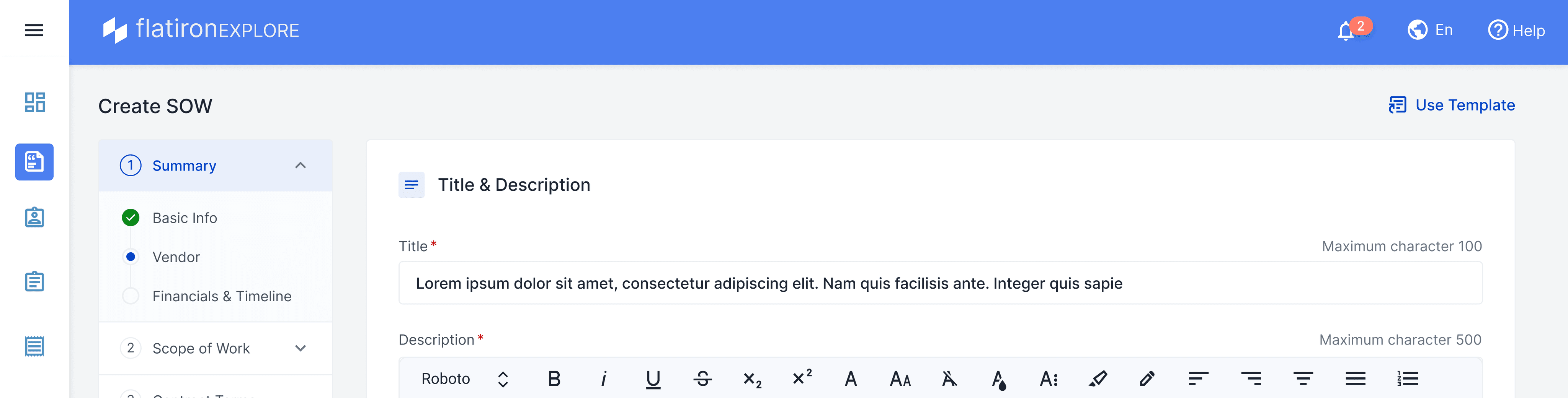
Tried left stepper, couldn't make it because responsive issues and it consumed space
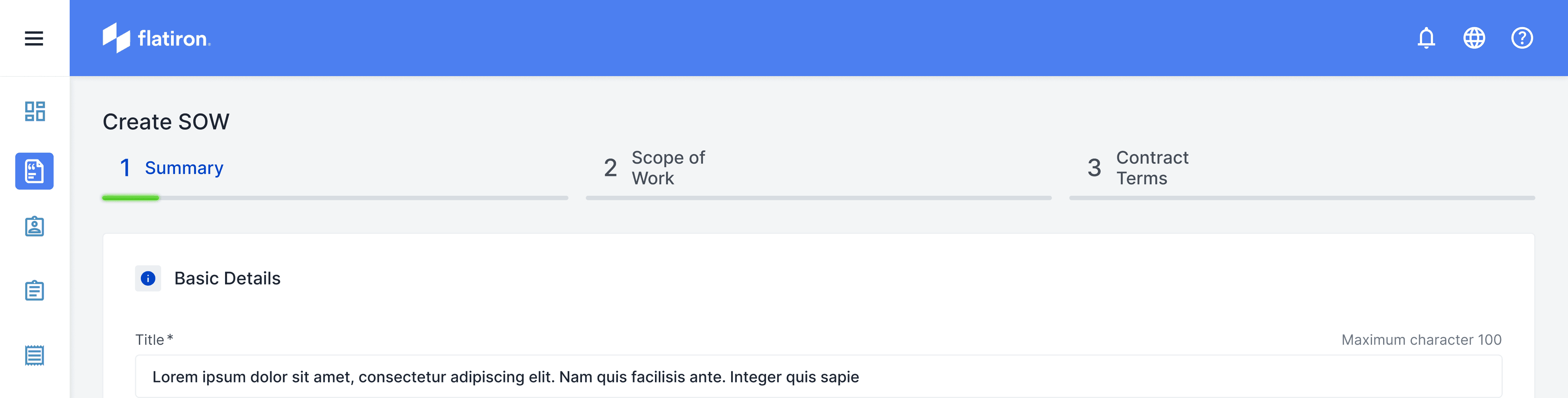
Put minimal version of top stepper with only three steps now
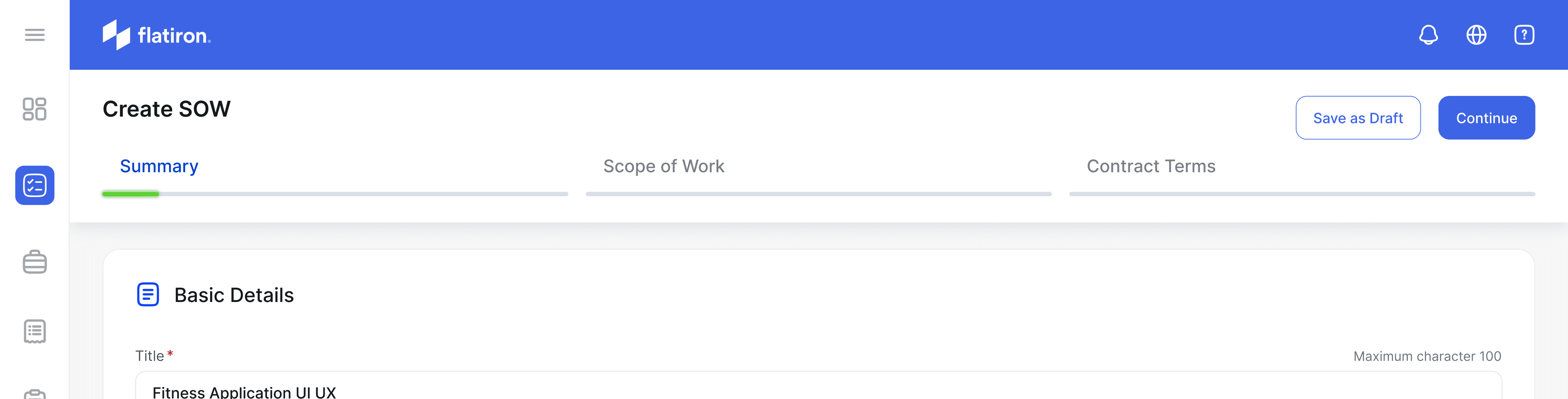
[Final] Refined it with CTAs on top right so more room for content below
Let's see why this header works best
The new header design serves dual purposes, addressing issues present in the previous UI:
Maximizing Screen Space: In the old design, both a header and footer were fixed, limiting the area available for displaying the actual SOW form. By removing the footer and optimizing the header, we've significantly increased the space for form content.
Streamlining Navigation: We've consolidated all user journey controls into the header. This includes a 3-step progress indicator and the 'Continue' button for advancing to the next step.
This redesign accomplishes several goals: It provides users with a clear view of their progress, keeps navigation controls easily accessible, and maximizes the screen area for form input.
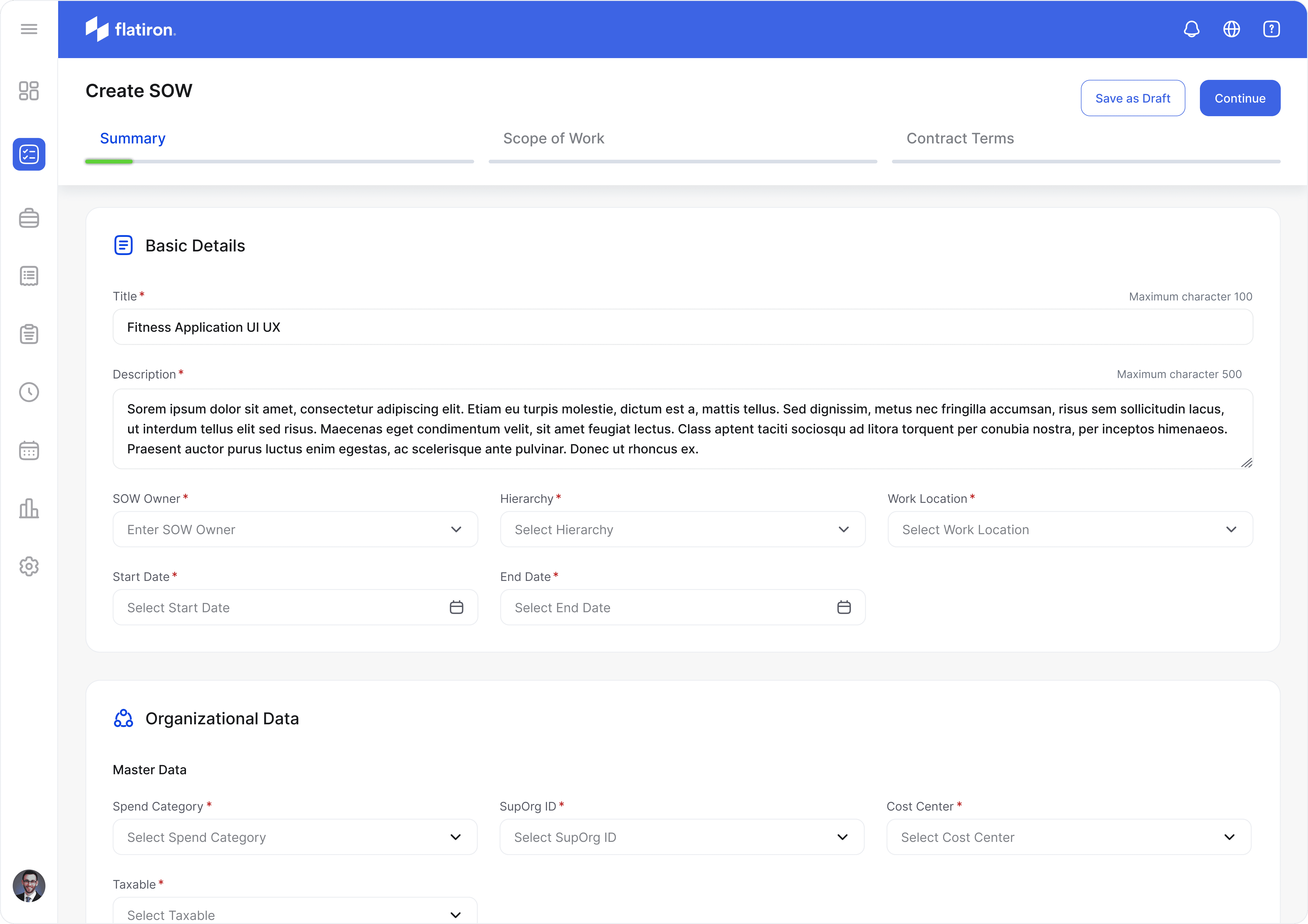
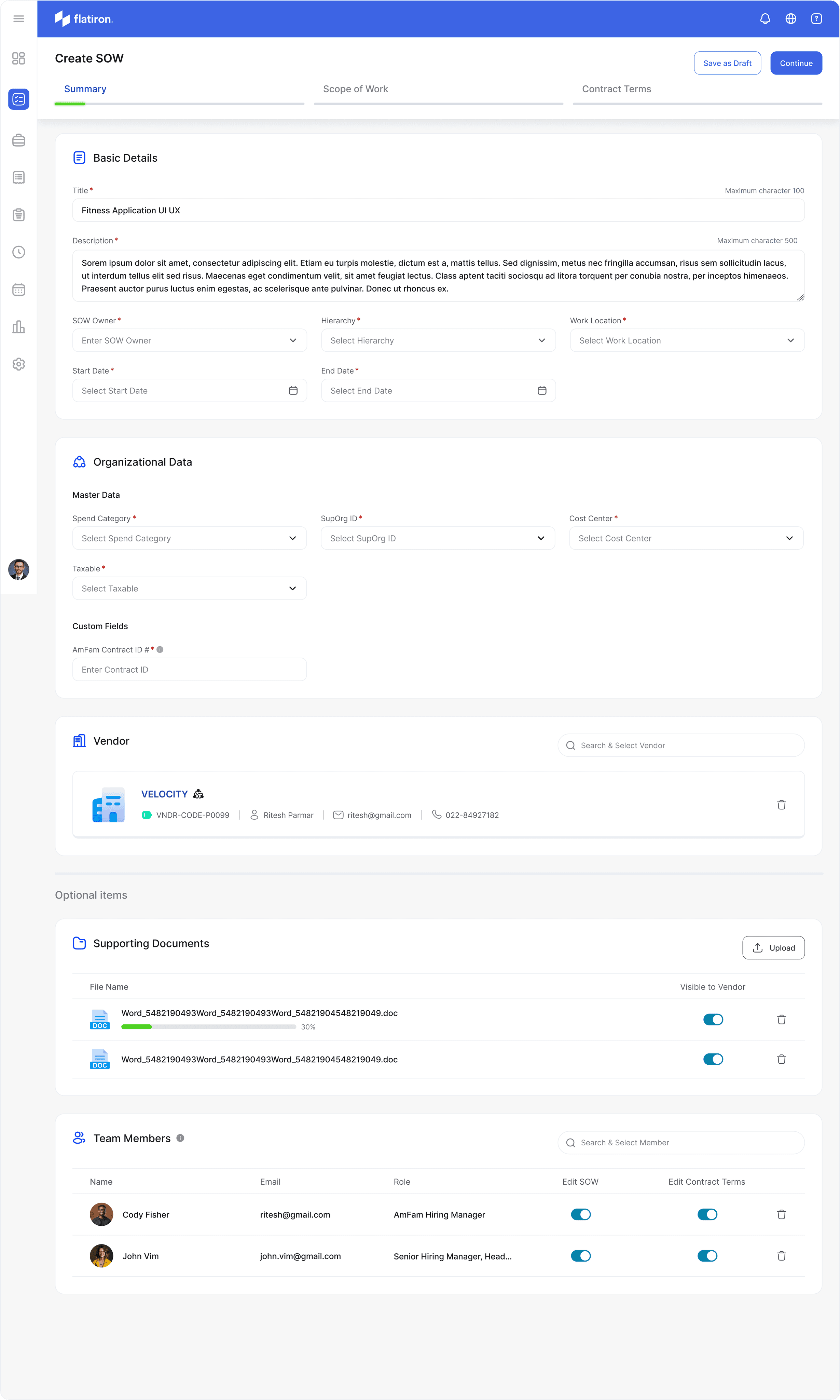
Redesigned Create SOW
We made the design look fresh and modern with new icons that match what they're for. We put each part in its own box to make it stand out and look important. We also made sure the text is easy to read for everyone, even people who don't see well. We changed our main blue color to make buttons and important things pop out more. All these changes make the whole thing look better and easier to use, so people can do their work faster and with less confusion.
We made the design look fresh and modern with new icons that match what they're for. We put each part in its own box to make it stand out and look important. We also made sure the text is easy to read for everyone, even people who don't see well. We changed our main blue color to make buttons and important things pop out more. All these changes make the whole thing look better and easier to use, so people can do their work faster and with less confusion.
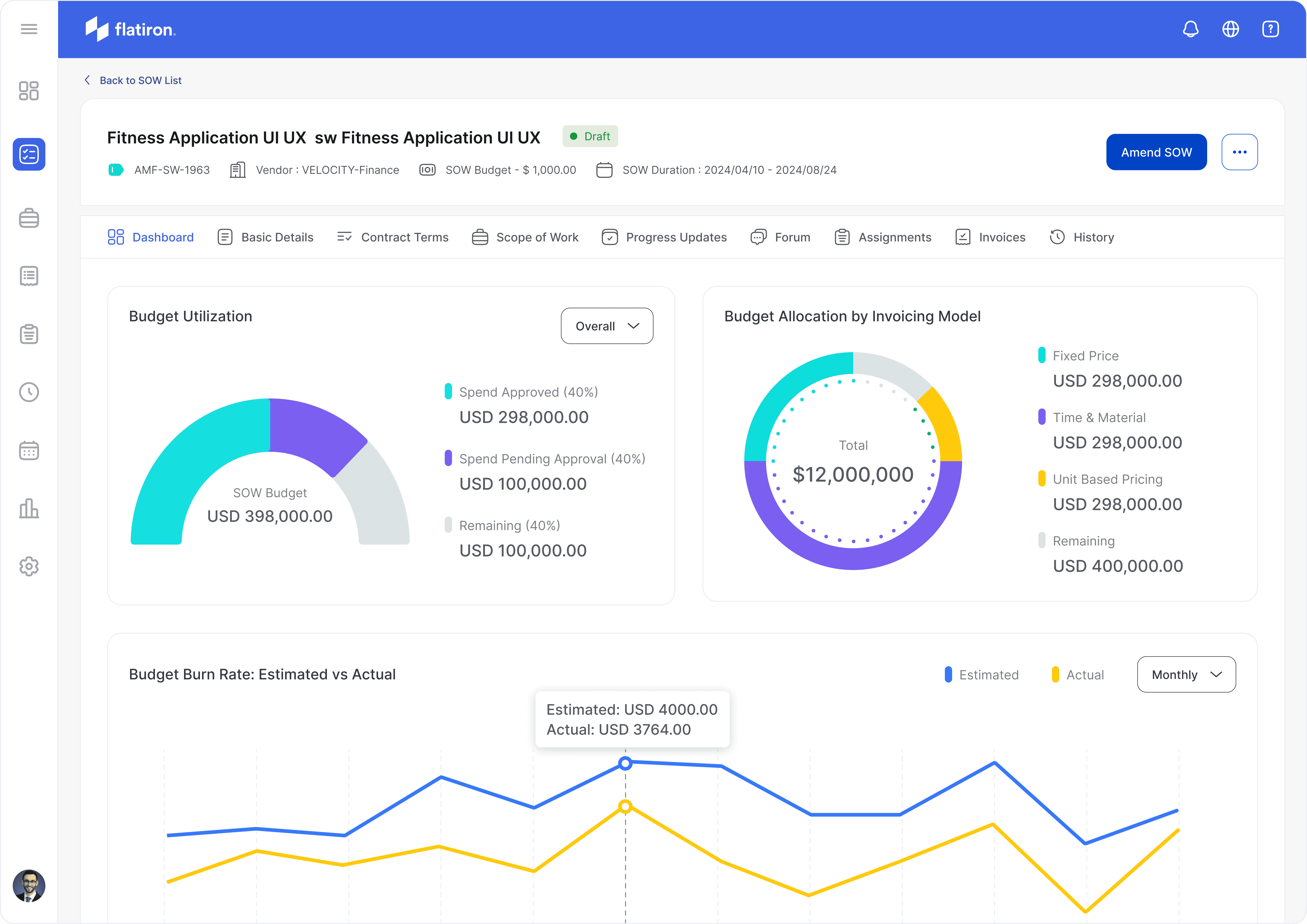
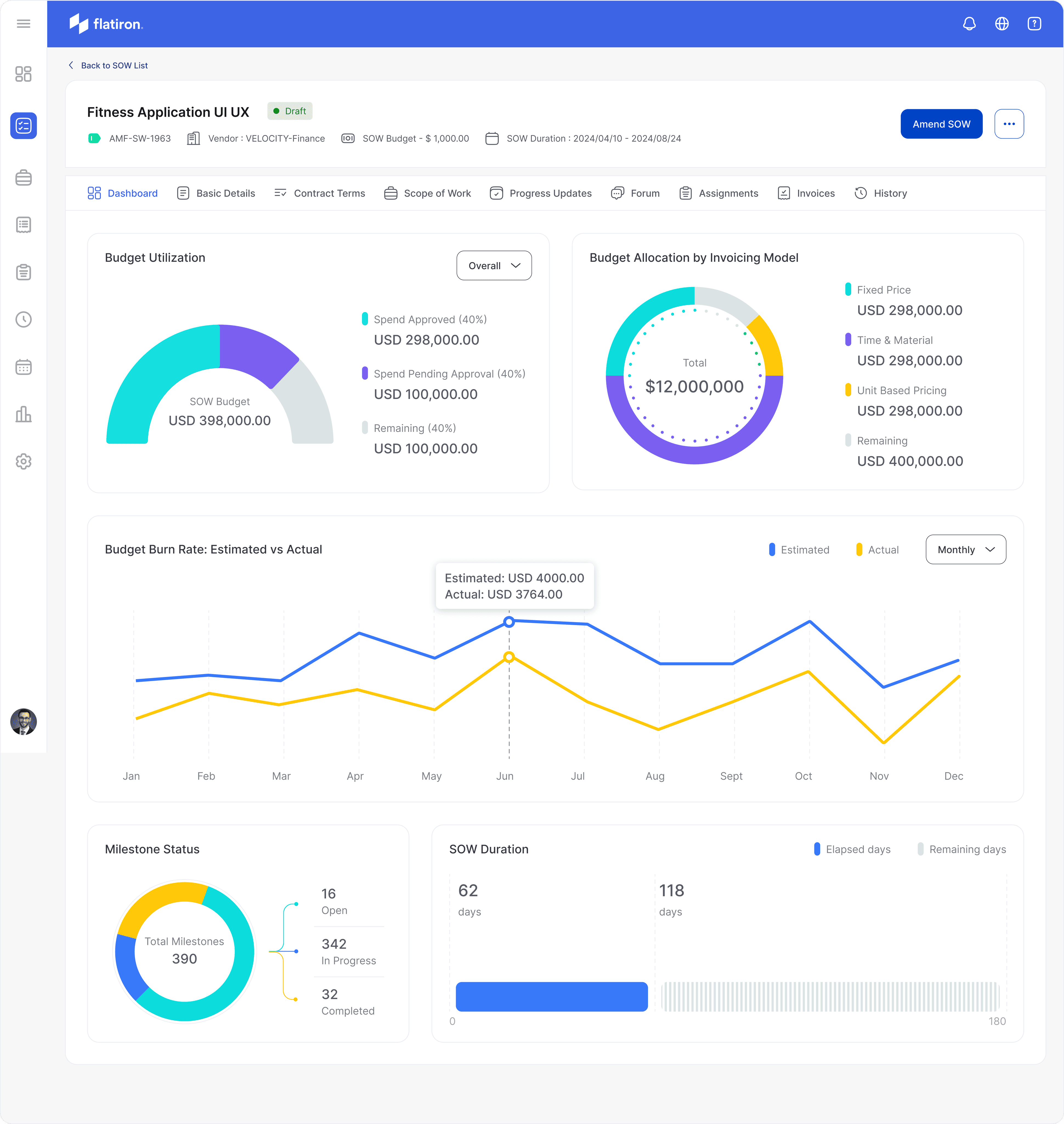
Redesigned SOW Details
We introduced the new tab called Dashboard to track activities withing this SOW. We used lot of data visualization to present relevant details to the client this largely helps them in decision making. We improved the header to make it look minimal and only show much needed information like vendor, budget and SOW duration.
We introduced the new tab called Dashboard to track activities withing this SOW. We used lot of data visualization to present relevant details to the client this largely helps them in decision making. We improved the header to make it look minimal and only show much needed information like vendor, budget and SOW duration.
We explored the top navigation showing two levels of stepper.
Tried left stepper, couldn't make it because responsive issues and it consumed space
Put minimal version of top stepper with only three steps now
[Final] Refined it with CTAs on right so more room for content below
We explored the top navigation showing two levels of stepper.
Tried left stepper, couldn't make it because responsive issues and it consumed space
Put minimal version of top stepper with only three steps now
[Final] Refined it with CTAs on right so more room for content below
Redesigned Create SOW
Redesigned SOW Details
The Problem
Our team, consisting of myself as an experienced UX designer, Raj (fellow designer), Divyanshu (Business Analyst), and Atul (Director), collaborated closely to conduct a comprehensive UX audit of the Statement of Work (SOW) management system. We not only leveraged our collective expertise and diverse perspectives but also reached out to several of our clients who had expressed concerns about the tedious processes within the system. This client feedback provided valuable real-world insights into user pain points and frustrations. Through this multi-faceted approach, we identified a range of issues that impact user experience, efficiency, and overall satisfaction with the product. Our analysis covered various aspects, from visual design and information architecture to workflow processes and user interactions, with a particular focus on addressing the concerns raised by our clients. The following list outlines the only few problems we discovered during our collaborative review and client consultations:
Information Overload: Overwhelming amount of data on screens.
Inconsistent Visual Hierarchy: Important information doesn't stand out.
Non-intuitive Icons: Unclear meaning of some icons used.
Repetitive Information: Redundant display of certain data across sections.
Poor Use of Color: Ineffective color scheme for highlighting important elements.
Lack of User Feedback: Unclear system responses to user actions.
Inflexible Layout: Potential issues with responsiveness across different screen sizes.
Lack of Data Visualization: Missed opportunities for graphical representation of numerical data.
Lengthy SOW Creation Process: Tedious 7-step process for creating a Statement of Work.
Suboptimal Information Architecture: Poor organization and structure of information.
This comprehensive list covers the major UX issues observed in the application, ranging from visual design problems to more fundamental issues with information architecture and user workflows.