Redesigned and enhanced a SaaS platform for influencer marketing, focusing on user-centered design to improve key features like the Relationships Board and Campaign Emails, contributing to significant revenue growth and user satisfaction.
Client Name
SARAL
Industry Domain
Influencer Marketing
Deliverables
Desktop UI/UX
Team
Solo Designer and CEO
Context
SARAL had already achieved its initial breakthrough when I joined the team. My mission was to elevate the platform from this foundation to its full potential. At the time, SARAL was generating about $360k in annual recurring revenue (ARR). Through my contributions, this figure climbed to an impressive $600k ARR.
My role involved implementing a wide array of enhancements and new features - over 120 in total. I know this figure because we meticulously tracked every improvement on Trello. This systematic approach allowed us to consistently refine and expand SARAL's capabilities, directly contributing to its significant growth in the market.
Design Approach
At SARAL, we adopted a User-Centered Design (UCD) approach that was crucial to our rapid growth and success. This approach allowed us to scale quickly with a small team and consistently deliver value to our users.
Our UCD Process
Our success hinged on the strong relationships our founder and CEO, Yash Chavan, cultivated with our users. When users encountered challenges with the product, they reached out directly to Yash. These user requests became the starting point for every feature and improvement we made.
Our process followed this user-centric cycle:
User Request -> Deep Dive with Users -> Brainstorming (Yash & I) -> Design Creation -> Development -> User Testing -> Feedback -> Iteration
1. We began with user requests, often communicated directly to our CEO.
2. We then engaged with users to understand their specific pain points or challenges.
3. Yash (our CEO) and I would brainstorm solutions based on these insights.
4. I would create designs for the most promising ideas.
5. Once developed, we'd send these solutions back to the users for testing.
6. User feedback was crucial, often leading to further iterations and refinements.
Impact and Results
This user-centric, agile approach enabled us to:
- Ship new features and enhancements every single week
- Maintain a rapid development cycle while ensuring each improvement directly addressed real user needs
- Drive substantial year-over-year growth
By prioritizing user needs and maintaining a quick iteration cycle, we significantly contributed to SARAL's growth and success in the market. This approach proved far more effective for our startup than traditional, time-consuming design thinking processes.
Design Showcase
Below are some designs I have worked on. Due to Non-Disclosure Agreement (NDA) constraints, I'm not able to share other designs from this project.
Relationships Board Redesign
The Relationships tab in SARAL is designed to help clients manage and nurture their connections with influencers throughout the collaboration process. It features a kanban board layout with several columns representing different stages of the influencer relationship: Prospects, Reached out, In Conversation, Onboarded, and Rejected.
Let's start with the user request we received.
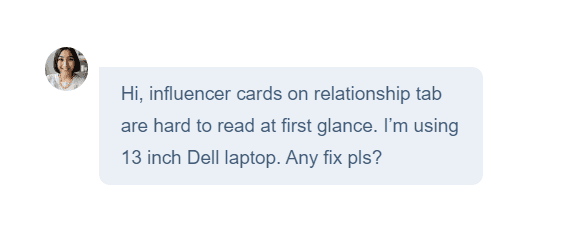
After receiving user feedback about the difficulty in grasping information on the influencer cards, Yash (CEO) and I initiated a discussion about revamping the Relationships board. We recognized several factors that justified this decision. We decided it was time to redesign the influencer cards to improve readability, information hierarchy, and overall user experience on the Relationships board.

We found out that influencer details presented in this card are improperly placed.
The influencer image is too small to view
Influencer name and their social media ID has no connection with the image
Followers and Rate are sub details of the influencer
Icon is small to view


After several iterations, we improved the influencer cards to address user feedback. We enlarged the profile image for better recognition and enhanced the influencer information hierarchy. To reduce clutter, especially on smaller screens, we replaced "Followers" and "Rate" text with icons. We also increased the size of social media icons for better visibility. These changes aimed to improve readability, optimize for smaller screens like the user's 13-inch laptop, and enhance the overall user experience on the Relationships board.
Notably, the new design reduced the overall height of the card, allowing users to view a greater number of influencers simultaneously, further improving the efficiency of the Relationships board.
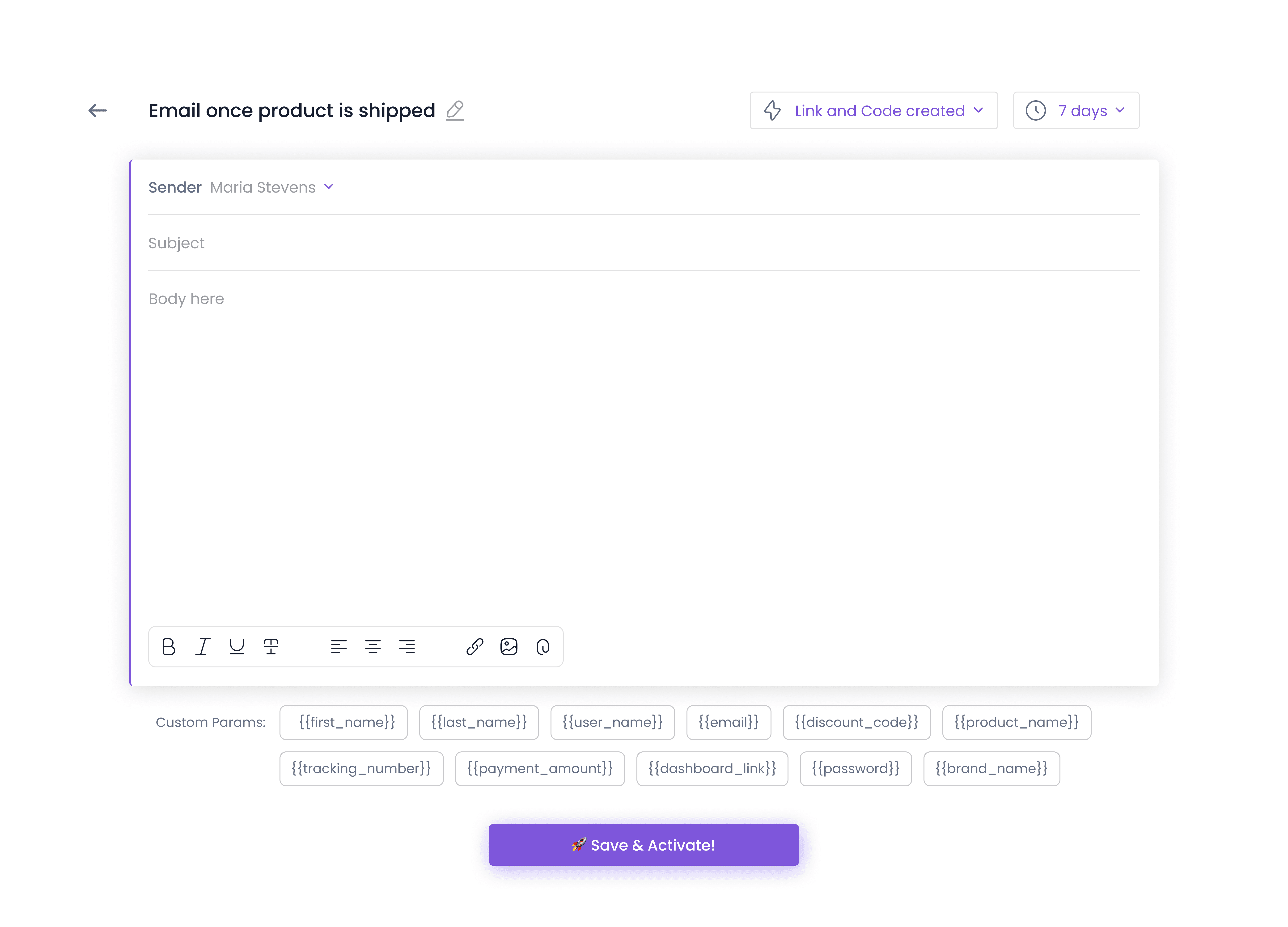
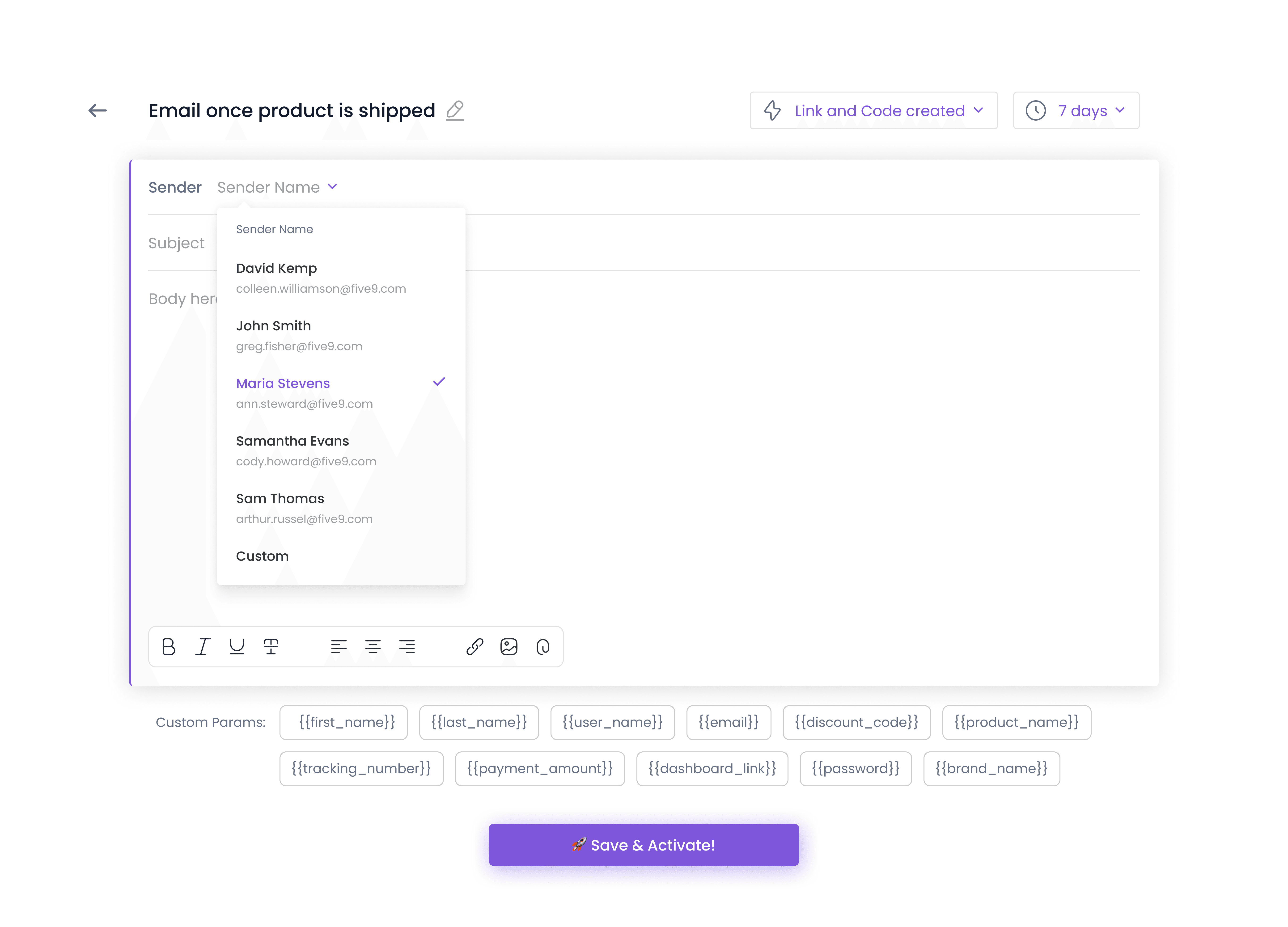
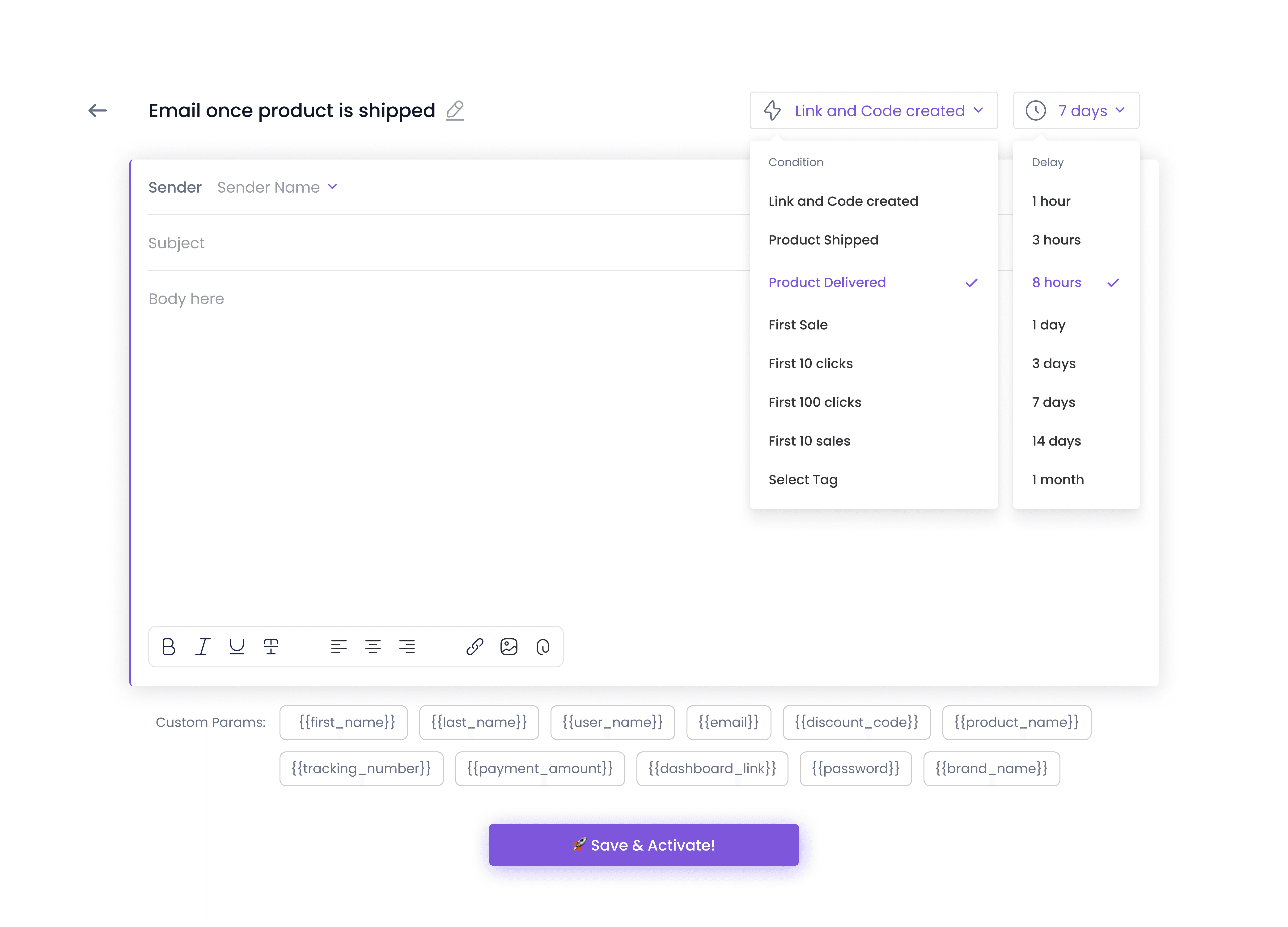
Campaign Email Redesign
Campaign Emails are a crucial feature of SARAL, used by our clients to communicate with influencers throughout their collaboration. These emails are particularly important for managing prospects - influencers who are potential collaborators, visible in the "Prospects" column of our Relationship Board.
The influencer campaign process is complex, often requiring multiple emails at different stages:
Onboarding Welcome Email
Email once product is shipped
Email once product is delivered
Reminder Email 7 days after product is delivered
Congratulatory emails for milestones (e.g., First 10 sales)
Given the importance of these communications, we recognized the need for a more engaging and user-friendly email interface within the SARAL app.
Design Challenge
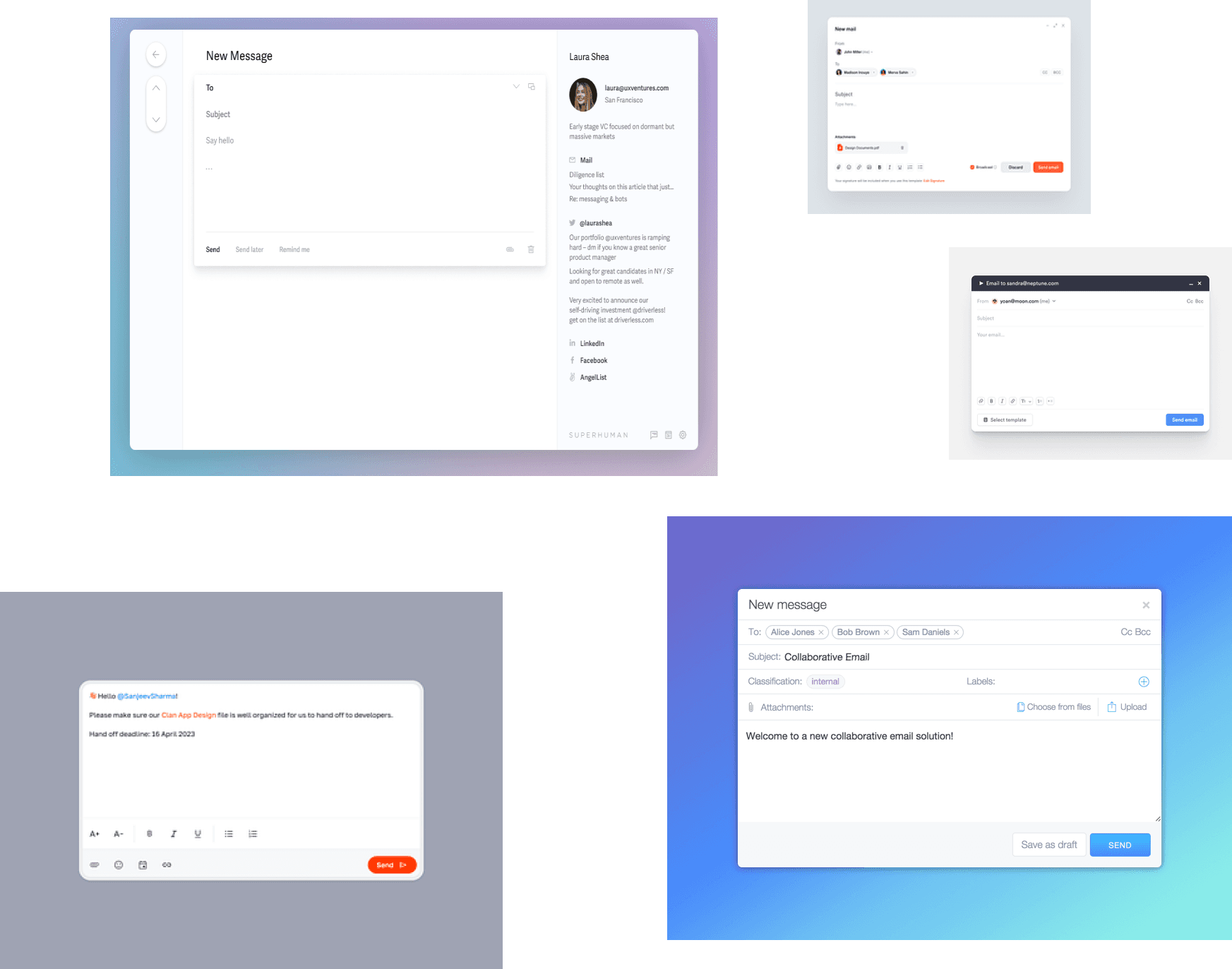
Yash (CEO) and I identified that our existing email UI within SARAL needed a modern refresh. Our goal was to enhance the user experience and make the process of creating and sending campaign emails more enjoyable and efficient for our users. Below is the previous email design.

Design Process
1. Moodboard Creation
To kickstart our redesign process, we prepared a moodboard. This helped us visualize our ideas and align on the aesthetic direction for the new email interface.During this phase, we made a key observation that would influence our final design: instead of using traditional labels for "Subject" and "Body" fields, we could use placeholders. This subtle change would give the interface a more elegant and modern look. It also streamlines the visual layout, reducing clutter and creating a cleaner, more intuitive user experience.
2. Feature Ideation
Based on user needs and market trends, we brainstormed several new features for the campaign email system:
Sender selection option
Conditional email sending based on specific criteria
Duration-based email scheduling
Throughout the design process, we maintained our focus on creating an interface that was minimal, simple, and most importantly, easy to use.
3. User Testing
After developing our new design, we proceeded with user testing. This crucial step allowed us to validate our design decisions and gather valuable feedback.
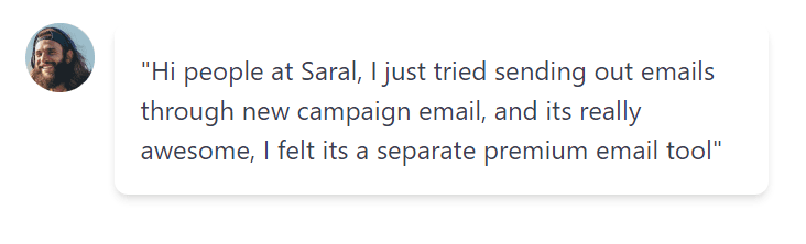
Results
The user response to the new Campaign Emails design was overwhelmingly positive. We received numerous appreciation messages, indicating that our redesign successfully met user needs and improved their experience with SARAL.
One particularly encouraging piece of feedback came from Alex, a SARAL user: